Saturday 26 March 2016

Audience Feedback On My Product


Below is some audience feedback on my final product which I gained through:

-Posting my magazine on Facebook and receiving comments
-Classmates who gave feedback on my magazine via post it notes

Personal commentary on criticism:

"I don't like Ed Sheeran won't appeal to your audience, don't use serif fonts either"
- This is the reason I chose such a controversial pull quote as I am aware it is one of which my reader will have many views on and want to find out more to why Florence and the machine said such a negative comment, so will get the magazine in order to find out the context. I included a serif font which is generally a big NO in media to emphasis the more controversial pull quote and to make the cover look more quirky.
"I Couldn't read the April easily"
- I am aware that putting an Arrow through the letters does make the text harder to read ;however this is the risk which I took in order to  make it look more appealing similar to 'Ke$ha' as it makes the artists name look more quirky and Indie which will appeal to my audience.
"Fonts different sizes on DPS"
-This was also intentional to make the most important quotes to stand out on the page e.g. "I am the luckiest girl in the world" was made one size larger as this is something which will lure in the audience to read the full article, this isn't challenging conventions too much as I have seen other magazines do this also through my research and planning.
"The magazine is a bit feminine, I wouldn't buy it personally"
-My audience would be young women, hence why a man wouldn't wish to purchase it for himself. which means that I did well at attracting the desired audience and reflecting particular social groups.
Overall, I feel as though my audience feedback was predominantly positive which gives me confidence in my product.


Displaying image1.JPG


Q7) Progression From My Preliminary Task To My Full Product


Here is a voice over which I created using Adobe Voice in which I look back at my preliminary task of a college magazine and talk about how I feel I have developed my skills from the progression from it to the full product of my Indie etc. magazine, looking at the four key areas which are:
-Photos
-Fonts
-Layout
-Modes of address.
Overall, I feel as though a clear progression has been made and would now say that I am performing at a much higher level in regards to construction.

Friday 25 March 2016

Q6) What I Have Learnt About Technologies Through Constructing My Product


Here is a Prezi document discussing how I have developed my understandings of technologies such as Photoshop and Blogger over the course of the year. Skills such as Depth of field when taking pictures on the Cannon DSLR to reverting to drafts on the platform Blogger.

Q5) How I Attracted My Audience


I created a video in which I discussed how my media product attracts my target audience of young women who are into Indie Music.

Wednesday 23 March 2016

Q4) Who Would Be The Audience For My Media Product


Here is a target audience profile I created as an annotated image board to reflect the interests of my target audience, ranging from music taste to fashion choices. Predominantly women would purchase my magazine as the content within is aimed towards them with the colour scheme, articles and images. As my magazine is of an Indie pop genre mainly young adults would be interested as they can relate far more to this idea of concerts and gigs unlike the elderly and youthful age groups. To accustom this niche young female target audience I made the content more diverse to ensure I attract everyone within the category featuring music, fashion, advise, etc.

Tuesday 22 March 2016

Q3) What Kind Of Media Institution Might Distribute My Media Product

Powered by emaze
I discuss which magazine publication company would be best placed to publish my magazine and also a couple ways in which I would distribute my media product.

Q2) How Does My Media Product Represent Particular Social Groups


I analysed the picture of the main artist on my magazine- focused on costume. showed how the mise-en-scene is similar to a conventional magazine cover image and talked about how I may or may not have conformed to stereotypes.

Monday 21 March 2016

Q1) In What Ways Does My Media Product Use, Develop Or Challenge Forms And Conventions Of Real Media Products


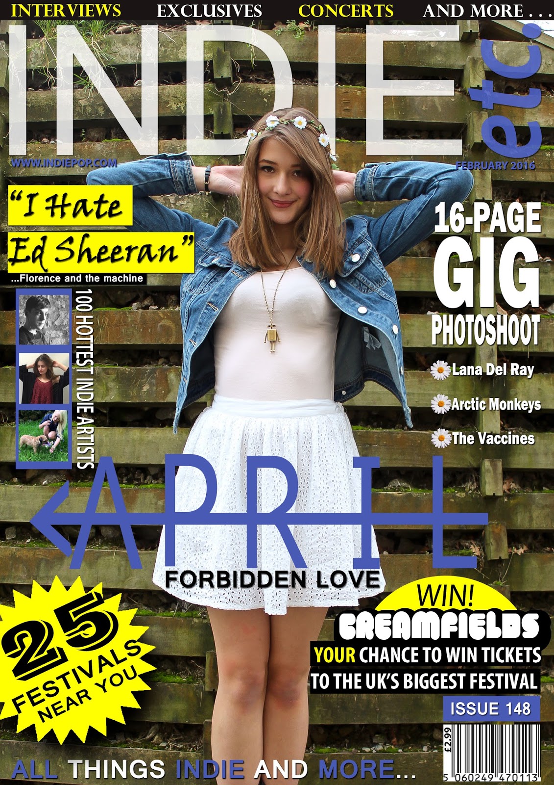
USES:: I based my media product off the conventions of real media products in order to make it look professional, but developing some to make it unique and original. My masthead  follows conventions as it is positioned in the top centre of the page, It is in a bold, capitalised, bright colour to make it more distinctive on the page and is placed behind the models head to make her the main attraction and to show that the magazine has its own strong brand identity. I have added a tagline of 'ALL THINGS INDIE AND MORE' as a way of promoting my product and to make it sound content enriched similar to how Q magazine's tagline is 'The UK's biggest music magazine' to represent power. My model is making direct mode of address with the audience to act as a focal point and to involve the audience making them more likely to be attracted to my magazine, through research I discovered every other conventional product used direct mode of address for their cover model. I stuck with a professional layout for my cover following the rule of thirds, having the most important articles on the left side. The articles were all positioned around the model to make her the centre of attention besides the most important exclusive interview. I included important information which is traditionally featured on a magazine such as a barcode, price, date and issue number. My magazine uses synergy by featuring the website for my company and following the same style and colour scheme throughout the cover, contents and DPS. The mise-en-scene reinforces the genre of the magazine as being Indie as traditional magazines do e.g. the model is wearing light clothing to portray innocence and a flower crown to show peace.
 
DEVELOPS: I decided to develop traditional conventions of music magazines to make my product more original and unique in order to appeal more to my target audience. The props of my magazine develop on traditional Indie pop magazines e.g. by adding a denim jacket to the otherwise innocent look to make the model look more edgy. The featured articles on the cover develop conventions e.g. 'I HATE ED SHEERAN' is a good pull quote to attract readers, but isn't very common for a magazine on singers and festivals but is a good way of attracting a wider audience. I decided to have my model wearing a short skirt to attract a secondary audience of men with the male gaze which is common for health or celebrity magazines but not so much with music magazines. I used a variety of fonts throughout my magazine which develops on magazines which only use one font, this was to make it more quirky and visually appealing; however I didn't add too many as I didn't want it to appear chaotic and unorganised. I made the main article emerge more above the others by having it in the centre of the page in the largest font out of all the articles which is common for magazines but decided to include a logo for April's name with an arrow similar to how Ke$ha has a dollar sign to appeal more to my indie audience.
 

CHALLENGES: My media product challenges conventions of real media products as I chose to target only a niche young female audience, unlike traditional magazines which attract as a mass audience of both genders and a wide age range. To attract my female target market I used a stereotypically feminine colour scheme of purple and featuring mainly women for my photographs. I included a puff on my front cover as a way of attracting my niche target market of festival lovers with 'WIN TICKETS TO CREAMFIELDS' as a way of persuading the reader to purchase the product so they are up with a chance of winning a competition. For my location of the cover photo I decided to take the picture outside which is unconventional as usually pictures are taken within a studio in order for them to look professional; however I felt as though taking the image with a grimy wall in the background would provide a nice contrast to the beautiful and elegant model and would make her stand out as the main attraction, so overall I felt as though this was a success. I challenged conventions throughout my magazine, such as on the DPS having the main image stretched onto both pages and having the text forming around the image unlike conventional magazines. which usually have the image on the left side and all the text on the right side

Thursday 10 March 2016

Edited Cover photo

Here is an example of how I edited one of my images for my magazine before using it as I wanted my pictures to be perfect and as all other magazines undergo heavy amounts of Photoshop on their images in order for the images to be used.

Monday 7 March 2016

Final Draft Cover


Indie Magazine First Draft

I created a first draft of my product before finalising it and got some feedback off my audience on things which they liked and things that they didn't like before making such edits to the magazine so it could be the best it could be some of which was:
-bad colour scheme
-obviously edited flower crown
-need more font variety
-text is too large
-image looks placed without editing 
-etc.
These are some of the things I went away and worked on before uploading my final media product.

Monday 22 February 2016

Selected And Rejected Photos


Powered by emaze
Here is a presentation consisting on some of the photos I took on the Camera DSLR 500D, ones which were chosen for my product and ones which got deleted afterwards.

Thursday 11 February 2016

Organisation Of Locations

It was very important for me to organise the perfect location for the background of my cover image in advance as this is one of the first things the audience will see. I decided to go for an outdoors background by having the model stood up against a wooden background as my audience profile of my audience said they are into nature and the outdoors, plus the background had an element of simplicity which allowed my model to stand out.

Tuesday 9 February 2016

Organisation Of Props

The mise-en-scene of my cover image is highly important to the media product as it acts as a mode of address in attracting the audience but also as a way of representing social groups.

Monday 25 January 2016

Audience Feedback On Mock Up Magazine

I asked a few peers to leave some feedback on my mock-ups so I knew what I needed to do to improve them. Above is what they put down.

Friday 8 January 2016

Indie Pop Contents Page Mock

By creating a mock up contents it gave me an idea of the overall layout and what it is that I need to include; however it looks very simple and too linear so this is an area which will require a lot of improvement to getting to the final product.